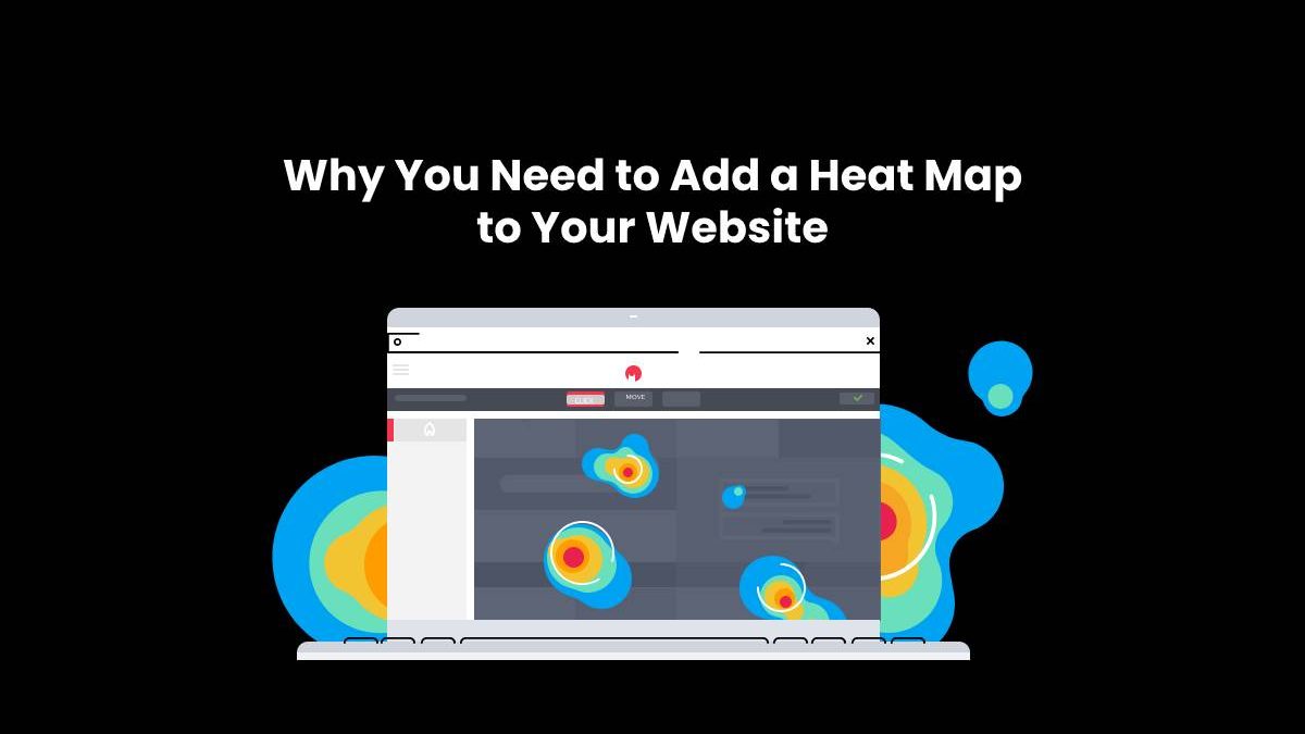
The heat map is a type of interactive tool that helps you find out which parts of your website users are clicking on the most.
When it comes to building websites, there are a lot of things that need to be taken into consideration. One important factor is ensuring that your website has the right content for its users and what they are looking for. This is important because it will help you understand what your visitors want and where they like to go on your website.
A heat map can help you gain a better understanding of how people interact with your website and how they use it. This will allow you to make changes in order to improve user engagement and conversions on your site.
Table of Contents
What is a Heat Map?
A heat map is a graphical representation of the visitors to a website. It can be used to identify which areas of the site are visited most and which are not.
In this article, we will discuss how heat maps can be used to improve your website’s user experience and how to add heat map to website. And how they help you identify which areas of your website need more attention.
Heat map is an effective tool for web analytics. It helps in identifying where users are spending most time on your website and what they find interesting or engaging. The color-coded visualizations show where people spend their time on the site and what they find interesting or engaging.
What is the Purpose of Adding a Heat Map to Your Website?
Heat maps are tools that help you understand where your website visitors are clicking most. This is a very useful tool for web designers and content creators to get a better understanding of what their site visitors are looking for, and where they might be confused or frustrated.
Heat maps can be placed on websites, landing pages, and other digital marketing materials to help you see how your audience is interacting with your website. They can also be used as an additional tool in Google Analytics to show the effectiveness of various marketing campaigns.
A heat map is an interactive visual representation of the activity happening on a website or page at any given time. The color of each pixel (or pixel group) represents the number of times that particular area was clicked by visitors during a specific period (usually one hour).
The Benefits of Using a Heat Map in Your Website Successful Strategy
A heat map is a visual representation of the users’ activity on a website. This tool can be used to track user’s activity on the website and to see where they are spending the most time.
The benefits of using a heat map in your website successful strategy include:
- Seeing where users are spending the most time on your site and what they’re doing there with session recording https://creabl.com/service/session-recording
- Identifying which pages are attracting more traffic, conversions, or leads; and
- Understanding how visitors interact with your site.
3 Ways to Add a Heat Map to Your Site Today
The heat map tool is a free and easy way to take a snapshot of your website traffic. This can be done by using the heat map website tool which helps you to create a heat map for your website. The tool also has other features such as the ability to customize the colors, size, and layout of your heat map. Heat maps are used for many different purposes. They help you see what parts of your site are getting more or less attention from visitors and how that changes over time. They can also help you understand where people are coming from when they visit your site, which is important information for optimizing future content strategy and marketing campaigns.
3 Ways to Add a Heat Map to Your Site Today:
- Use Google Analytics, the tool of choice for optimizing all sorts of marketing campaigns, to add a heat map to your site.
- Use Google Tag Manager to embed the code on your site with one line of Javascript and then use a library called Plotly to animate it in real-time.
- Use WordPress plugins such as Wonderplugin or Heatmap for WordPress.

